TrinketLab is a young company that designs and produces 3D-printed products.
The client needed a logo redesign that would better reflect the brand’s activity and feel more suitable for
its audience, which includes children and teenagers. The requested direction was based on chemistry-inspired
imagery, especially a laboratory flask combined with the company name.
PERIOD / February 2025
Process
The goal was to create a cleaner and more flexible logo that could be used across social media, fairs, and
brand materials.
The redesign needed to keep the connection to experimentation and making, while improving readability and
making the visual style lighter.
Old TrinketLab’s logo
/ DESIGN DIRECTION /
I started by reviewing the old logo and the client’s requirements. The previous version already used a flask,
so the main task was to keep the recognizable idea while making the logo easier to apply in different formats.
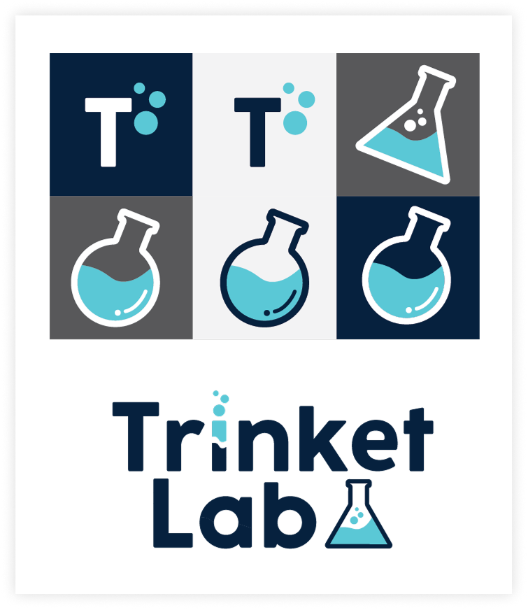
Logo concepts and compact icon variationsTrinketLab logo exploration
I explored several concepts combining the wordmark with chemistry-related elements: different flask shapes,
bubbles, and compact icon variations. These options helped define how direct or minimal the laboratory
reference should be.
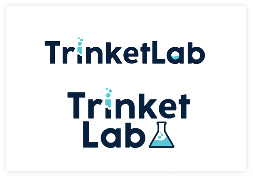
After reviewing the concepts, the client preferred the version with the shorter name, TrinketLab, and a
triangular flask. This option became the final direction.
Final logo direction
Results
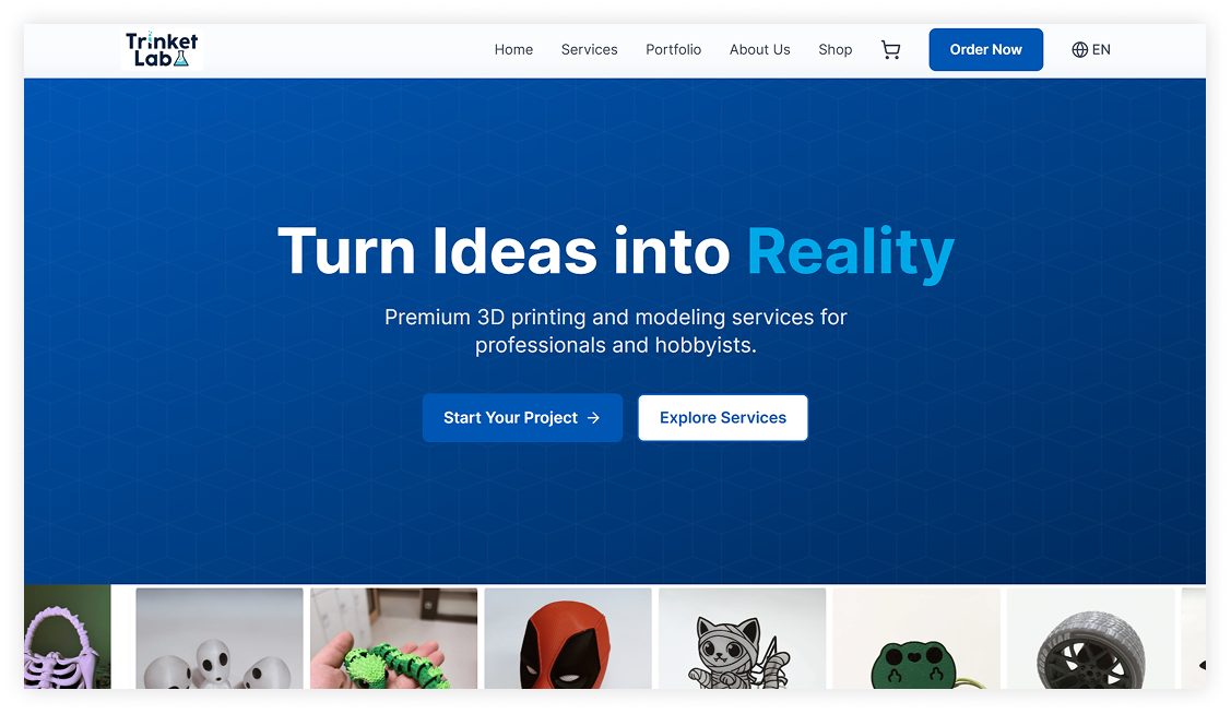
The redesigned logo became the working logo of TrinketLab.
It is currently used by the company in social media and at fairs, helping the brand present itself in a more
consistent and recognizable way.
TrinketLab website use example
/ WHAT THIS PROJECT TAUGHT ME /
This project helped me practice simplifying a client’s initial idea into a clearer brand mark.
It also showed how small visual decisions — shape, proportion, icon placement, and wordmark balance — can
make a logo more practical for real use.