ScandiBalt Survey is a marine surveying brand operated by an established company with long-standing experience in the industry.
The client needed a distinctive logo that would reflect the company’s professional positioning and create a consistent visual foundation for its brand materials. The project is still in progress, and the current case study shows the first logo directions and the decision-making process behind them.
PERIOD / March 2026 - now
Process
The goal was to create a professional logo connected to the company’s field: maritime
surveying, shipping,
and the Baltic region.
The logo needed to feel relevant to the maritime industry, visually reliable, and distinctive enough for further brand development.
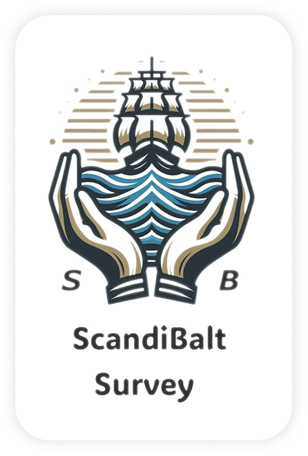
Old logo
Reference for a new logoReference for a new logo
/ DESIGN DIRECTION /
I started by reviewing the client’s existing logo, learning more about the business, and studying visual
references from other companies in the industry.
Based on this research, I explored several maritime directions: navigation elements, anchors, waves,
ship-inspired shapes, and Scandinavian Viking boats.
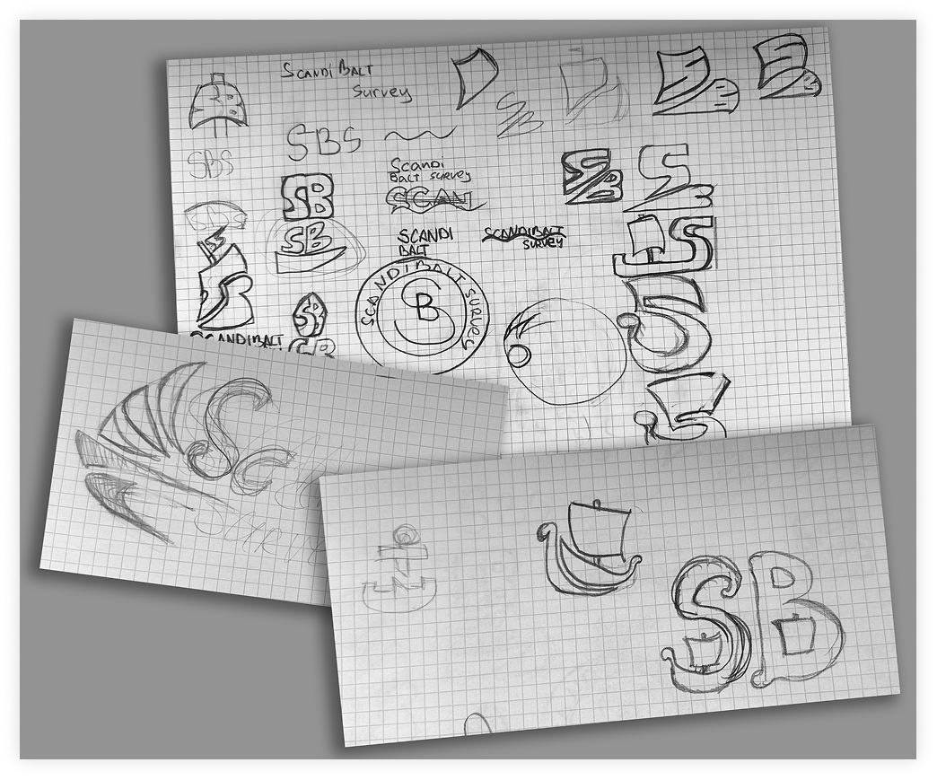
Sketches and early directions
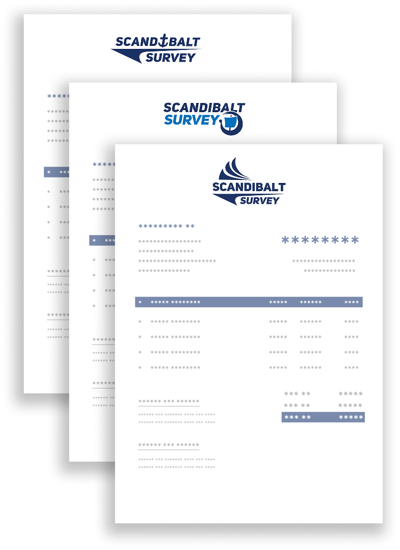
The first ideas were sketched on paper to quickly test different compositions and symbols. After that, I
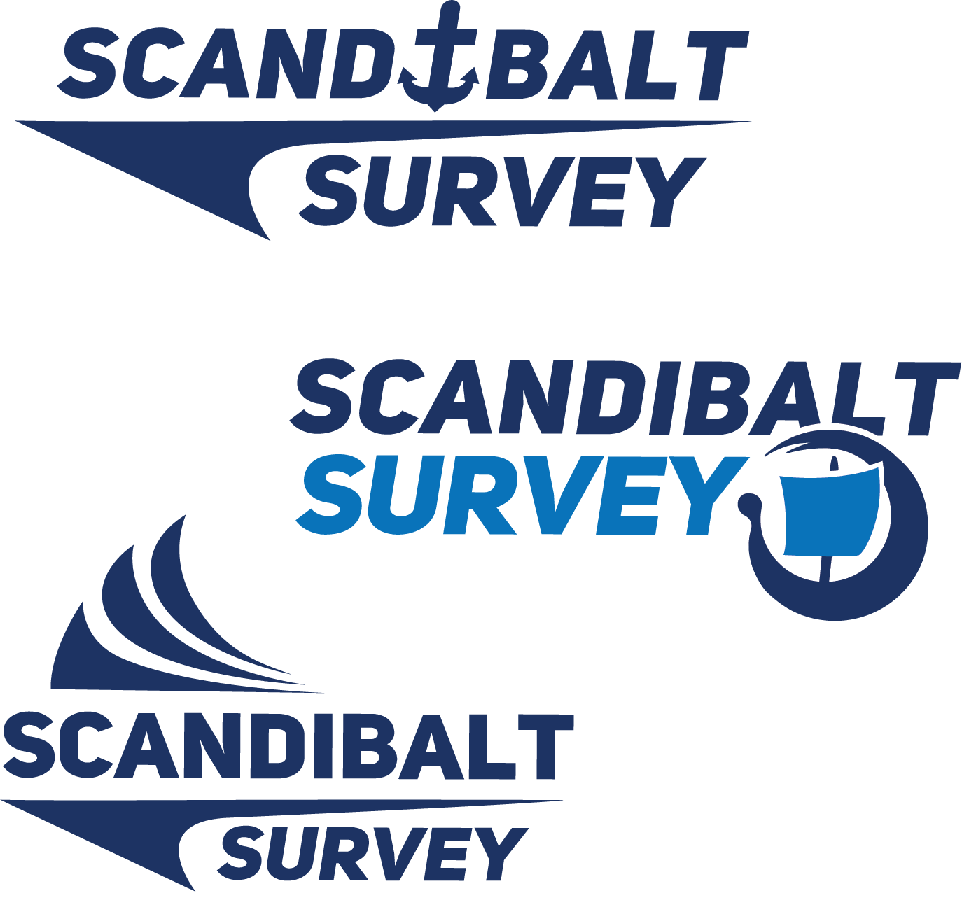
moved the strongest directions into Illustrator and created three initial logo concepts.
The concepts explored different ways to combine the company name with maritime imagery.
One version used an anchor as a direct reference to shipping. Another explored a more compact emblem-like
structure. The third option focused on a wave and sail-inspired shape, creating a stronger sense of movement
and direction.
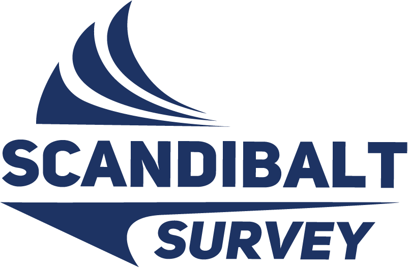
After reviewing the options, the client chose the third concept as the direction to develop further.
Early results
After client feedback, the third version became the main direction for refinement. However, the client also
noticed that it had some similarity to a competitor’s logo.
Because of this, the project is still being developed. The next step is to keep the strengths of the chosen
concept while making the logo more distinctive and ownable for ScandiBalt Survey.
/ WHAT THIS PROJECT TAUGHT ME /
This project helped me practice designing for a specific industry context.
It also showed the importance of checking visual similarity early in the process. A logo can match the
client’s taste and business direction, yet still need refinement to become more unique and reliable for real
brand use.

 WORK IN PROGRESS