This project explores the design of a fitness app that helps beginners plan workouts, understand exercise
techniques, and navigate gym equipment with more confidence.
The prototype was based on user research and focused on two main scenarios: finding a workout and finding
instructions for a specific gym machine.
PERIOD / January 2025 - June 2025
Process
The goal was to create an interactive prototype that reflects the needs of beginner gym users.
The app had to help users:
find suitable workouts;
understand how to perform exercises correctly;
learn how gym machines work;
track their progress;
feel more confident during training.
The main design challenge was to make the app useful for people who want to exercise, but feel unsure about
where to start.
/ RESEARCH /
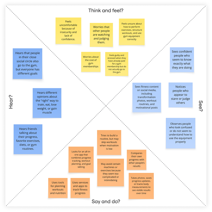
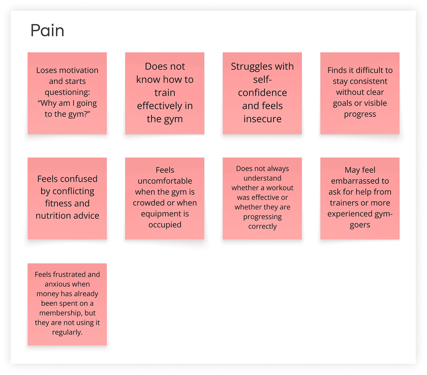
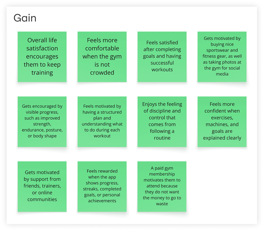
The project started with interviews and an empathy map. The research showed that beginner gym users often
feel uncomfortable because they do not know how to build a workout, use equipment, or perform exercises
safely.
Empathy mapPain pointsGain points
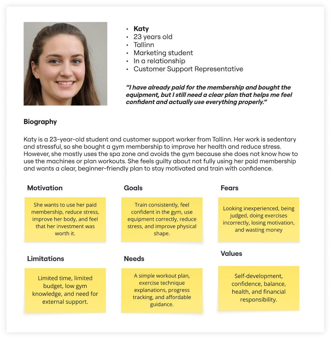
Based on these findings, I created a persona and a user story:
Persona
“As a student with a busy schedule and a limited budget, I want to receive a clear and
understandable workout plan with explanations of exercise techniques, so that I can overcome the psychological
barrier of being a beginner at the gym, use my membership and fitness equipment effectively, reduce stress,
and improve my physical fitness.”
This helped define the main direction of the product: clear guidance, simple navigation, and practical
support during the workout.
/ EARLY PROTOTYPING /
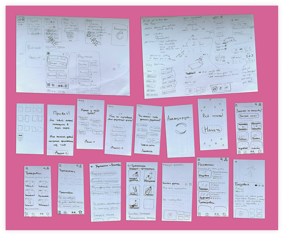
Before moving into high-fidelity design, I worked on paper prototypes to define the structure and key flows.
The early prototype included two scenarios:
finding instructions for a gym machine;
finding a suitable workout.
At this stage, I also considered interaction details such as transitions, confirmation screens, progress
indicators, back navigation, and the sequence of screens.
Low-fidelity paper prototype
The paper prototype was tested with users. Although participants were able to complete the tasks, the tests
revealed problems with categories and navigation. Some sections were not intuitive enough, which caused
hesitation and slowed users down.
Based on this feedback, I revised the content structure and improved how workouts and equipment instructions
were grouped.
/ DESIGN DIRECTION /
After several rounds of testing and refinement, I moved to a high-fidelity interactive prototype.
The final direction focused on making the app feel easy to enter, even for users with little gym experience.
The interface provides quick access to recent content, personalized suggestions, workout categories, and
machine instructions.
The goal was to avoid overwhelming users and help them choose the next step with less uncertainty.
/ KEY SCREENS /
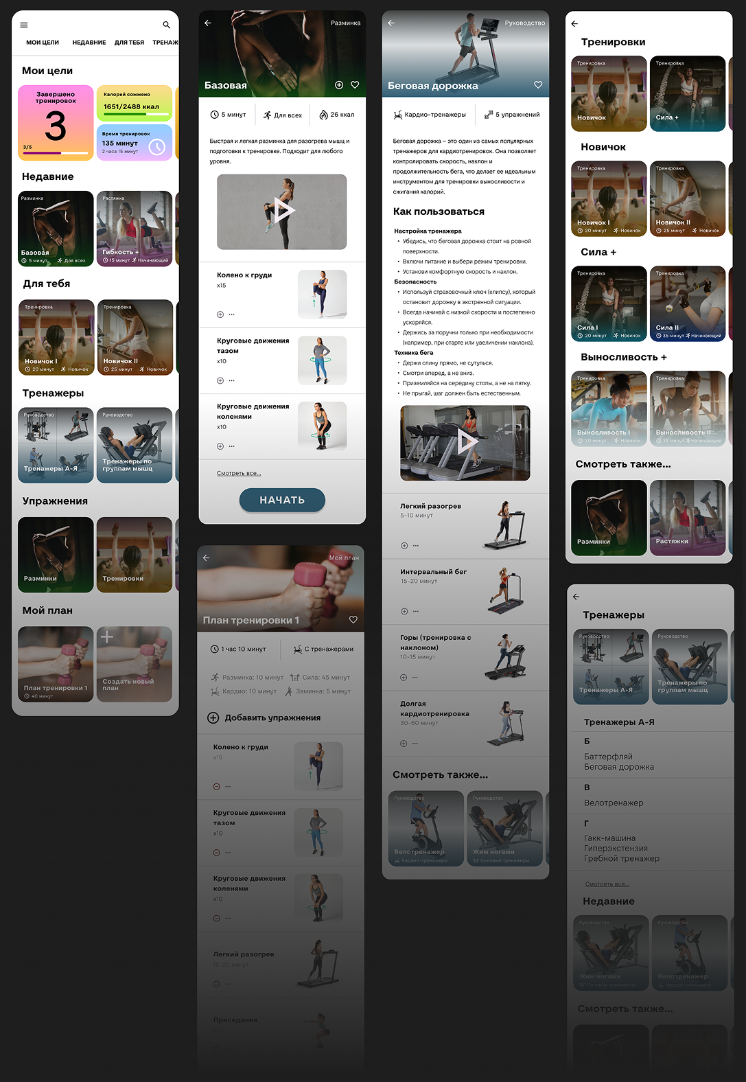
High-fidelity screens
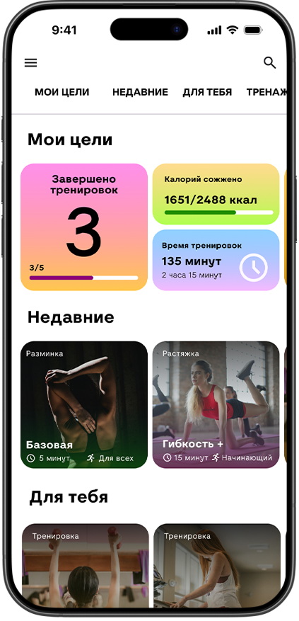
Home Screen. The home screen gives users quick access to the main parts of the app.
It includes search, account settings, personal statistics, recently viewed workouts or machine instructions,
personalized recommendations, machine categories, and workout categories. The personal statistics block helps
users track progress and stay motivated, while the “recent” section makes it easier to return to content they
already viewed.
Workout Page. The workout page gives users key information before they start.
Users can see the estimated duration, recommended fitness level, approximate calories burned, a short
description, and a video demonstration. They can also view each exercise separately. The main action is
starting the workout. Users can also save it to favorites or use it as a base for creating their own workout
plan.
Gym Machine Page. The machine page explains what a specific machine is used for and how it works.
It includes useful information about the machine, a video demonstration, exercises that can be done on it,
and similar or popular machines. This screen supports users who may see a machine at the gym, but feel unsure
about how to use it correctly.
Active Workout Flow. The workout flow is presented step by step.
For each exercise, users can see the name, duration, and a video demonstration. They can pause or continue
the workout, view the upcoming exercise queue, skip an exercise, or stop the session. This structure helps
users stay oriented during training and reduces the need to remember the whole plan at once.
watch a video!
Results
The final outcome is a high-fidelity interactive prototype that covers the main user scenarios: discovering
workouts, learning how to use gym equipment, and following a workout step by step.
The design was shaped by user research and testing. Early usability feedback helped improve the app
structure, especially categories and navigation, before the final prototype was created.
/ WHAT THIS PROJECT TAUGHT ME /
This project helped me practice designing from user research rather than assumptions.
It showed how important it is to test navigation early, especially when the product contains many content
categories. Even when users can complete a task, hesitation and confusion reveal where the structure needs
improvement.