Anna Teada is an Estonian digital civic service that allows residents to report public-order and
urban-environment problems to local municipalities and government institutions. The existing service already
supported the core reporting function, but the research identified UX issues around interface clarity,
navigation, and transparency of the issue-handling process. The goal of the project was to design and test an
improved interactive prototype that makes reporting, tracking, and understanding civic issues easier and more
trustworthy.
PERIOD / January 2026 - April 2026
Process
/ PROBLEM /
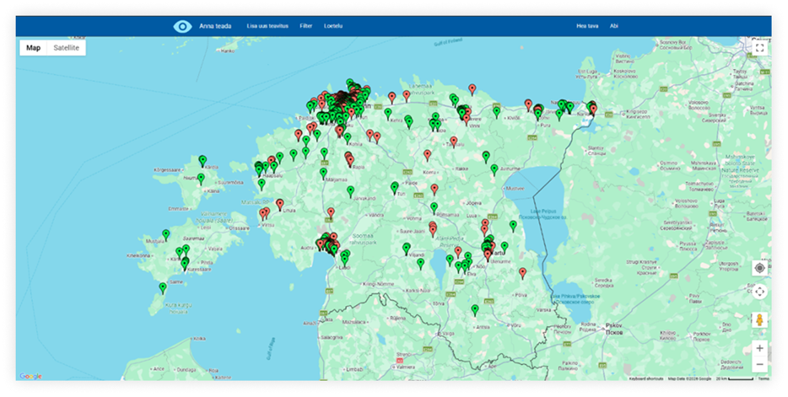
The current Anna Teada experience is heavily map-centered. When users open the service, they immediately see
a map with many report markers. Reports can be viewed through map pins and basic filtering, but there is no
full search function, which makes it difficult to find a specific report or return to it later.
Another key problem is transparency. Report status is represented mainly through the color of a map marker
rather than a detailed processing history or clear status logic. This makes it harder for users to understand
what happens after they submit a report and whether responsible authorities are actually taking action.
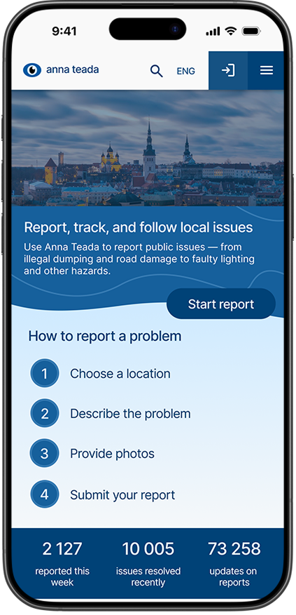
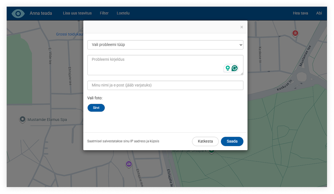
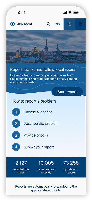
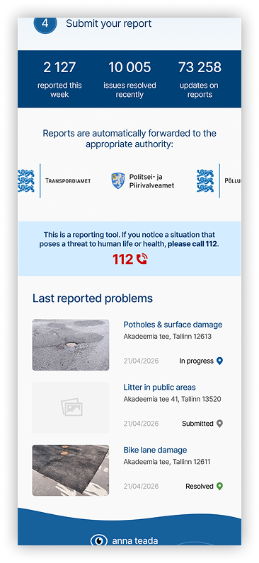
Anna Teada homepageReport submission process in Anna Teada
/ RESEARCH PROCESS /
The research combined three data sources: literature on UX and civic digital services,
analysis of similar
reporting platforms, and user feedback collected through task-based testing and questionnaires.
For the first round of user research, 15 participants interacted with the current Anna Teada
service. They
completed three tasks: understand what the service is for, find a specific report by screenshot, and create
their own report. After that, they filled out a questionnaire with rating-scale, multiple-choice, and
open-ended questions.
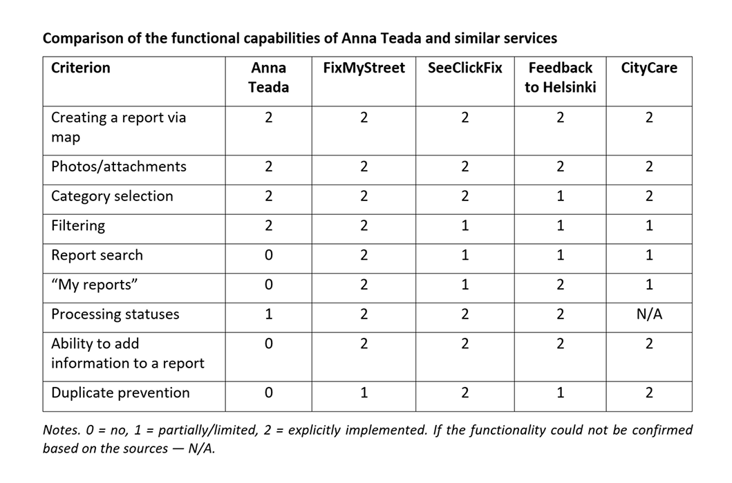
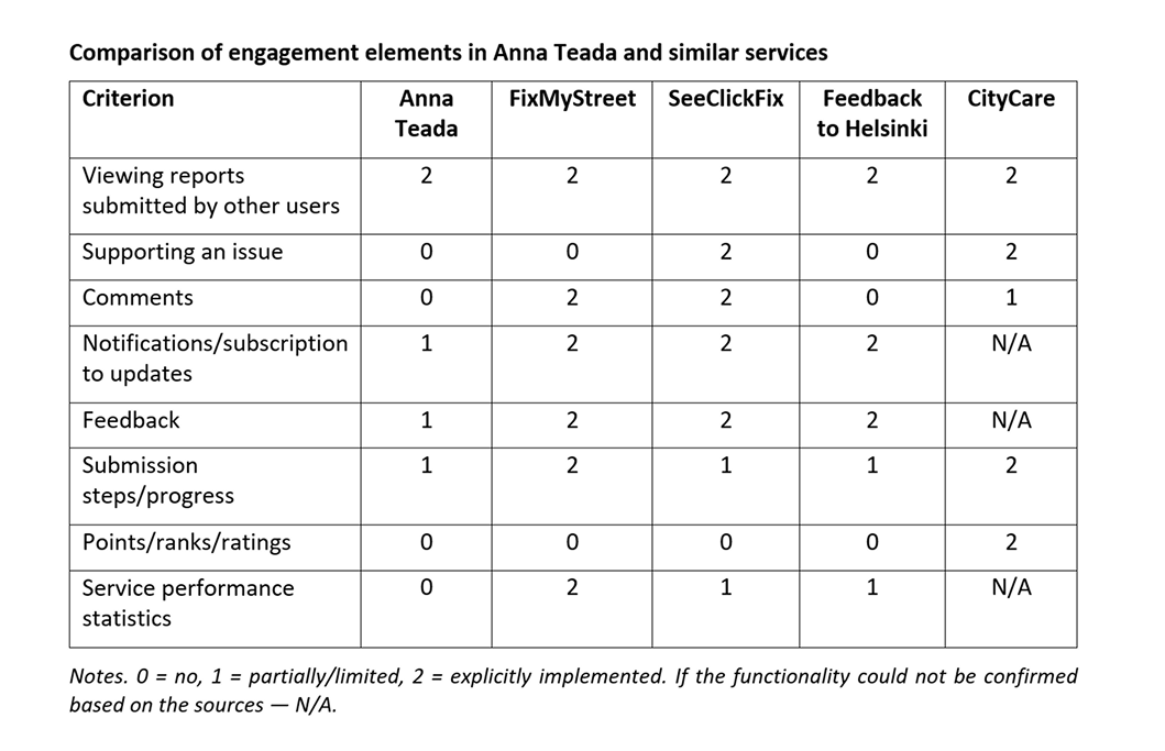
A comparative analysis was also conducted across FixMyStreet, SeeClickFix, Feedback to
Helsinki, and
CityCare. The comparison focused on navigation, search and filtering, reporting flow, statuses, feedback,
transparency, visual clarity, and trust-building interface patterns.
Comparing of the functional capabilitiesComparing of the engagement elements
/ KEY FINDINGS /
First-time experience was unclear. Users landed directly on the map and did not
immediately understand what the service was for or how to start. Instructions existed, but many users felt
they only partially explained the service logic.
Finding reports was difficult. Since Anna Teada did not have search as a dedicated
function, users had to rely on the map. Report cards also lacked stable orientation points such as a precise
address, which made it difficult to identify reports when users did not know the area.
The map was visually overloaded. A large number of markers made the interface feel slow,
visually noisy, and hard to interpret. This affected both usability and perceived reliability.
Statuses and process transparency were not clear enough. Users were not always sure what
different marker colors meant, whether an issue was being processed, or what happened after a report
disappeared from the map.
Duplicate reports needed better support. When a problem already existed on the map, users
were not always sure whether to support the existing report or create a new one. The interface therefore
needed a mechanism for showing nearby similar reports before creating a new one.
/ DESIGN PROCESS /
The redesign shifted the service from a map-first reporting tool to a more guided civic service with clear
entry points, transparent statuses, and stronger support after submission.
The design direction was based on five principles:
Make the service self-explanatory. Add a welcome screen that explains what Anna Teada is,
how reporting
works, and what users can do next.
Reduce dependence on the map. Support search by address and keywords, filtering by
category/status/date,
and sorting.
Make reporting step-by-step. Break the report submission process into clear stages with
validation,
examples, and visible progress.
Make the process transparent. Use explicit statuses, report history, confirmation
screens, and explanatory
microcopy.
Support follow-up interaction. Allow users to return to reports, subscribe to updates,
support existing
reports, and add clarifications.
/ PROTOTYPING /
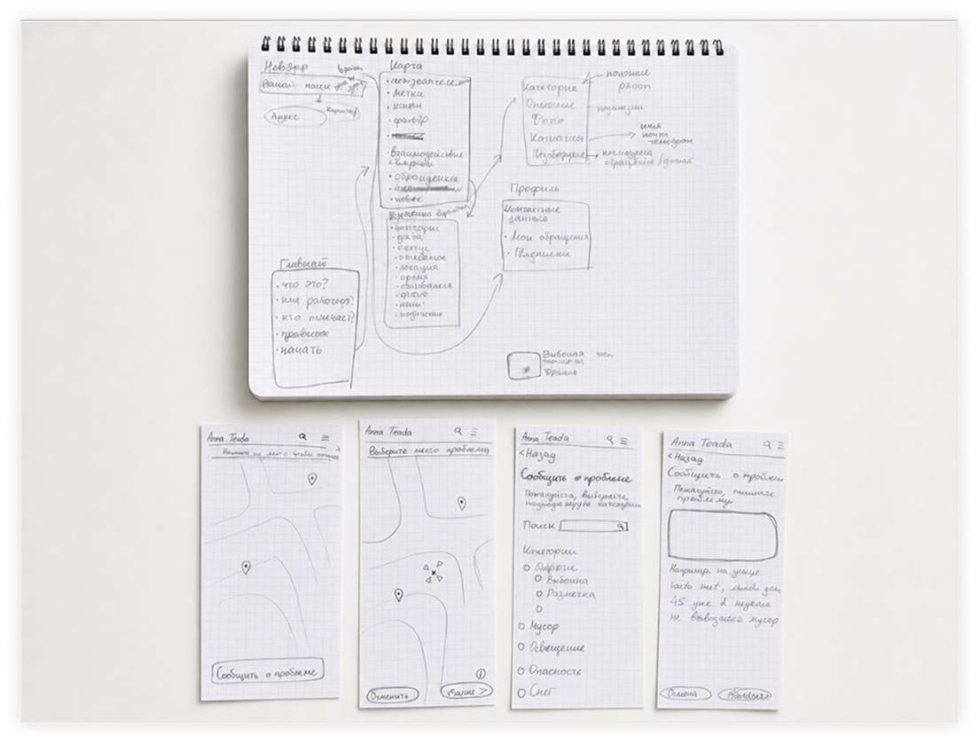
The design process started with low-fidelity paper sketches to define the structure, screen
list, and key
functions. After that, the project moved into medium- and high-fidelity Figma prototypes. Each screen went
through approximately 4–5 iterations based on user feedback.
The final Figma prototype included interactive screens for the homepage, map / search / filtering, report
creation, report view, and system confirmation states.
Low-fidelity paper sketches
/ KEY SCREENS /
The final prototype included the following key screens and flows:
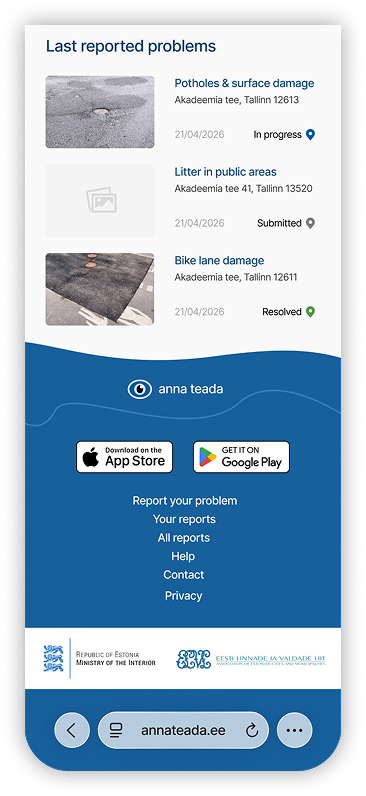
Welcome page. A new landing page introduces the service, explains how to report a problem,
shows recent
activity, and gives users a clear path to the map. This directly addresses the issue of users landing on a map
without understanding the service context. The Figma appendix shows the homepage with a short explanation,
steps for reporting, statistics, recent reports, and links to official authorities.
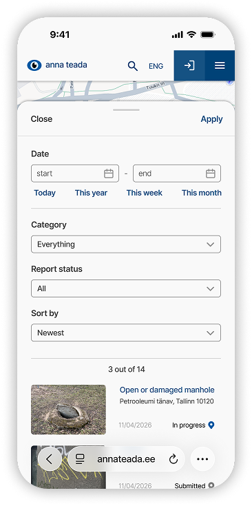
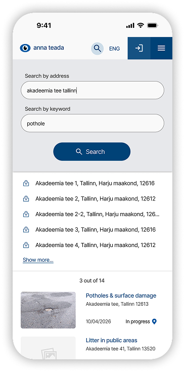
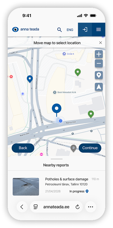
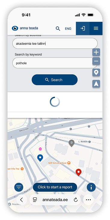
Improved map, search, and filtering. The map screen was redesigned to include search by
address and /
keyword, filters by date category / status, and sorting. This gives users more ways to find relevant reports
without manually scanning the map.
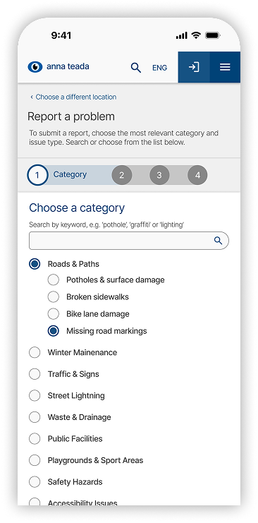
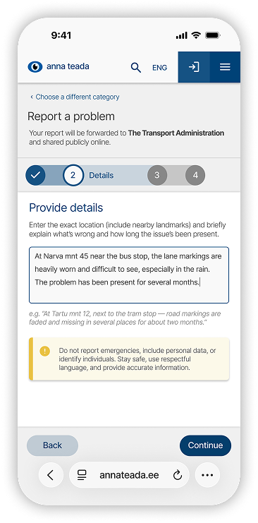
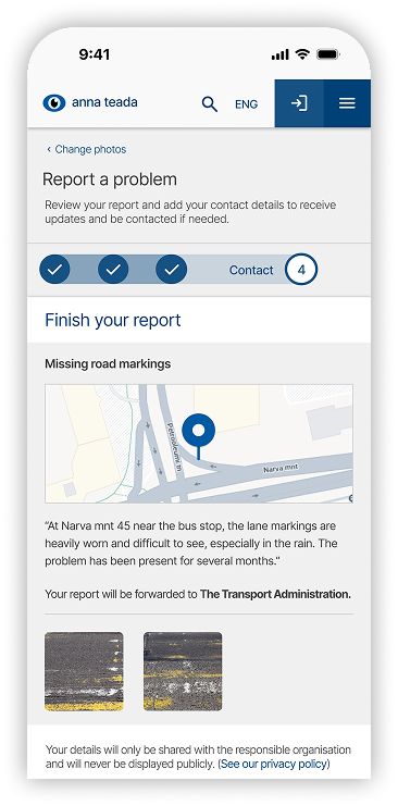
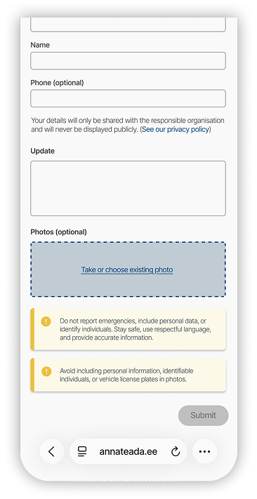
Step-by-step report creation. The report flow was redesigned into a guided process:
location, category,
description, photos, contact details, and final review. Each step includes hints, validation, and the ability
to go back and correct information.
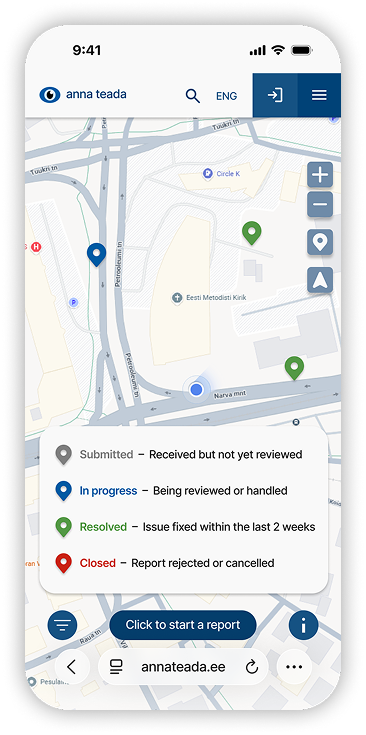
Clearer status system. The prototype introduced four explicit statuses:
Submitted — report received but not reviewed yet
In progress — report is being reviewed or processed
Resolved — issue was solved within the last two weeks
Closed — report was rejected or removed
This structure was designed to reduce uncertainty and make
the handling process easier to interpret.
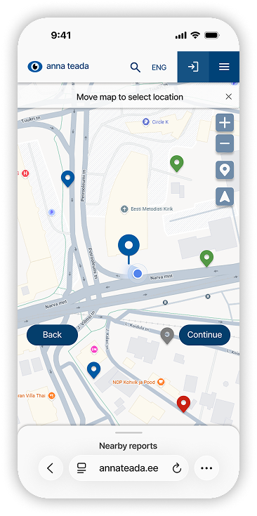
Duplicate prevention. During report creation, the prototype shows nearby similar reports.
Users can review
them, support an existing report, or continue creating a new one.
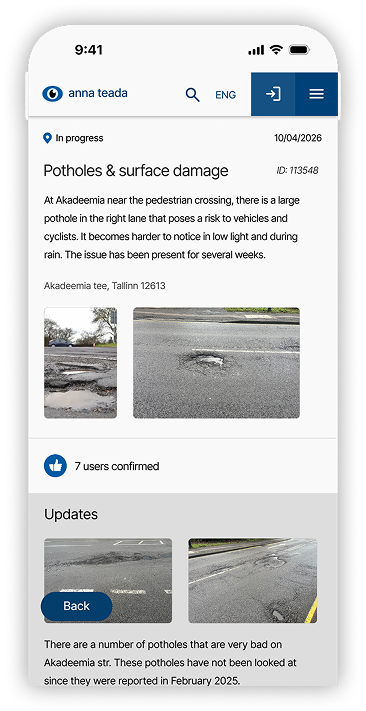
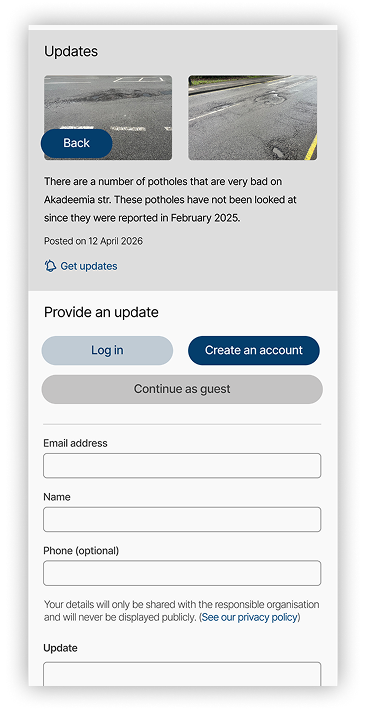
Report detail page. The report page includes the issue description, photos, status, updates,
and interaction
options. Users can support the issue, subscribe to updates, or add additional information.
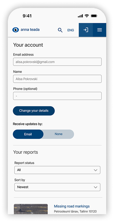
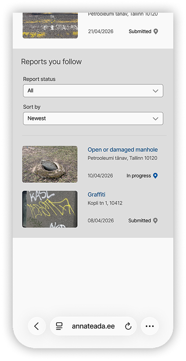
Account and notification settings. For logged-in users, the account page contains personal
data, the user’s
own reports, followed reports, and notification settings. This helps users return to reports without searching
for them again on the map.
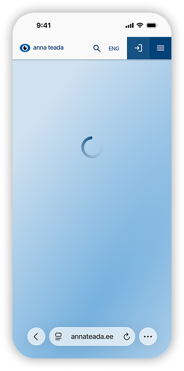
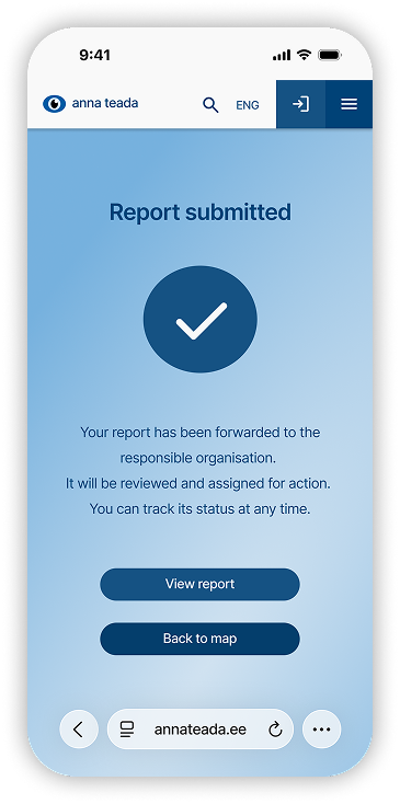
System feedback and confirmation states. The prototype includes loading screens,
intermediate states, and
confirmation screens so users understand when the system is processing an action and what happened after
submission.
watch a video!
Results
The final prototype was tested with 15 users on mobile devices. Participants completed three key scenarios:
creating a report, searching for a report, and viewing / interacting with a report.
The results were positive:
14/15 users rated convenience as 4 or 5 out of 5.
14/15 users rated clarity as 4 or 5 out of 5.
15/15 users rated reliability / officialness as 4 or 5 out of 5.
12/15 users rated their likelihood of using the service again as 4 or 5 out of 5.
Users generally completed the tasks without additional help. The step-by-step reporting flow was perceived as
logical and predictable, users made fewer unnecessary returns, and the redesigned interface was described as
more modern, structured, and trustworthy.
/ NEXT STEPS /
The next step is to refine the parts of the prototype that still caused questions during testing: resolved
report history, guest notifications, location selection, and login flow.
Further development could also include full multilingual support in Estonian, Russian, and English, a
help/FAQ section, clearer information about responsible authorities, and service statistics showing how many
reports are processed and resolved.
/ WHAT THIS PROJECT TAUGHT ME /
This project allowed me to dive deeper into the specifics of civic tech and understand how digital public
services can build trust through transparency, clear feedback, and predictable user flows.
I studied how similar platforms explain the reporting process, show issue statuses, support follow-up
actions, and help users understand that their input has been received and considered. This helped me see how
important communication is in services where the result is not immediate.
This experience was especially valuable because it gave me a clearer understanding of the responsibility
behind designing municipal and government-facing platforms. If I have the opportunity to work on public-sector
digital services in the future, this project will help me approach them with more attention to trust,
accessibility, transparency, and real user needs.